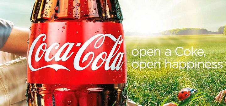
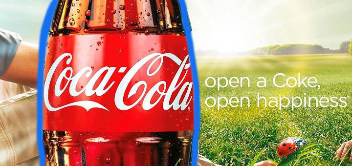
The advertisement I chose to reverse engineer was this Coca-Cola ad with the slogan, “open a Coke, open happiness.” The concept first created by the advertising agency Wieden + Kennedy, and was then developed into ads in print, TV, and on billboards by several different advertising companies. This campaign was first launched in 2009 during American Idol.
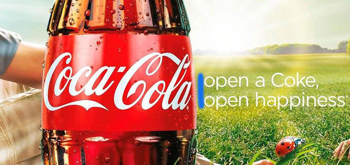
Alignment
These lines are placed on the page very intentionally, with a left alignment and centered on the page. Your eye is naturally immediately drawn to them.
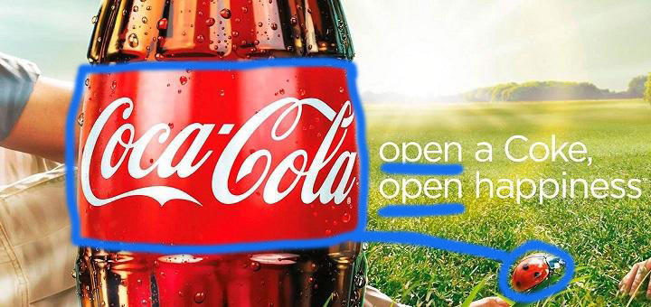
Repetition
There are a couple of things that are repeated I noticed; The first is that both lines start with the exact same word. Also, the red in the coke bottle matches the red in the ladybug.
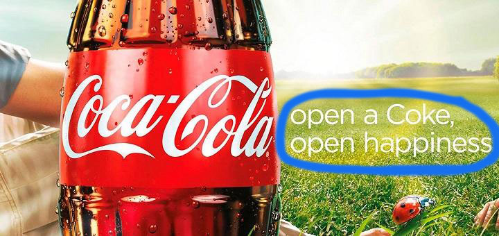
Proximity
These lines are consciously placed close together. The creator of this add didn’t worry about the white space and try and make the text fill up more of the page.
Contrast
The Coca-Cola bottle in the advertisement is a bold contrast to just about everything else. The colors are bold and bright in contrast with a lighter background making it stand out.
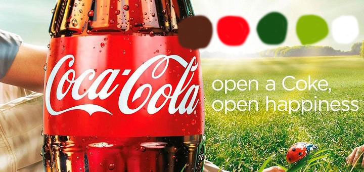
Color
This ad has strong use of complimentary colors, with all of the main components being red and green. These colors complimenting each other makes this add easy to look at.
Conclusion
Overall, I think that this advertisement effectively and deliberately uses all of the principles of design to make this ad compelling and visually interesting. All of the principles work together to make a great design.

