A look at a Burt’s Bees ad Campaign along with a reimagined version of the ad created using Adobe Photoshop.
Introduction
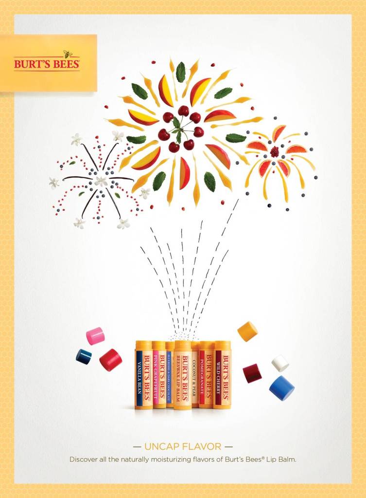
Designed by the agency Baldwin&, I found the original design on https://www.adsoftheworld.com/campaigns/uncap-flavor. I think they are such a colorful representation of all the fun and exciting flavors of Burt’s Bees Chapstick.
Original Ad Analysis
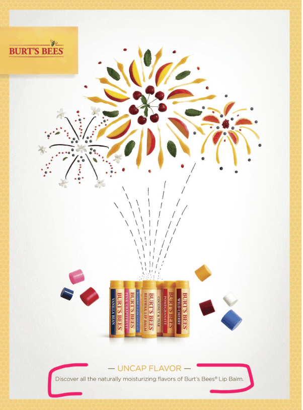
Design: This ad does a great job of using contrast with the very light and white background. It makes the bright and bold colors stand out perfectly in comparison. There are many contrasting colors within the ad to bring visual interest and stimulation. The ad uses grouping by putting all the text together and separating the message and the visuals. I love the use of repetition and consistency between all of the ads in this campaign, they always used the same fonts and similar visuals especially when it came to the text at the bottom.
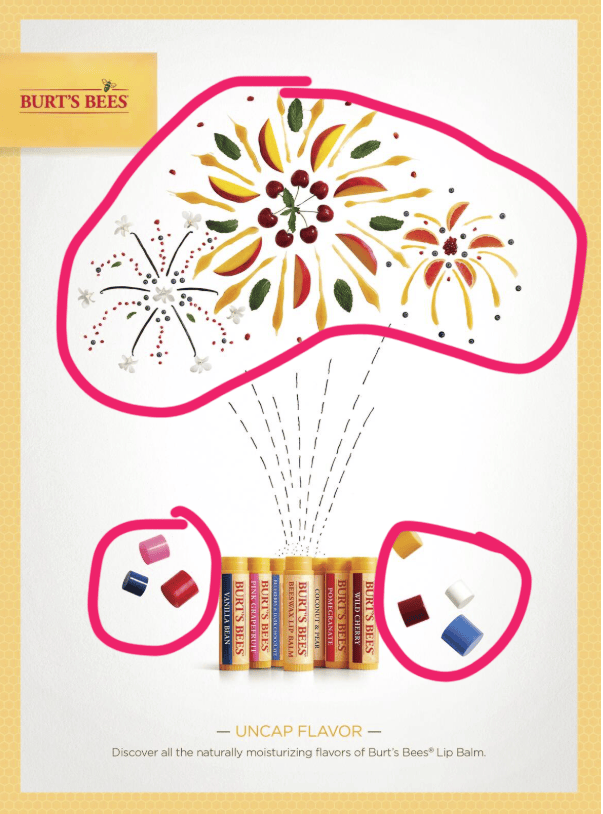
Color: I absolutely adored the use of color by the designers in this ad. They use the bright colors that match the different chapstick flavors and I think that is really cool. The ad is full of contrasting colors that are all around the same value but different hues making the ad feel uniform but the colors still stand out and contrast with each other.
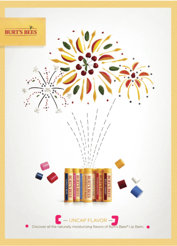
Typography: The typography in this ad was pretty simple, but it is intentionally simple. The main part of this ad is the bright and bold visuals and that is where the designers want your eye to be initially drawn. The text is sans serif in colors that match the tubes of chapstick rather than the caps. The heading and body text are in contrasting colors to help them stand out.
Reimagined Ad Analysis
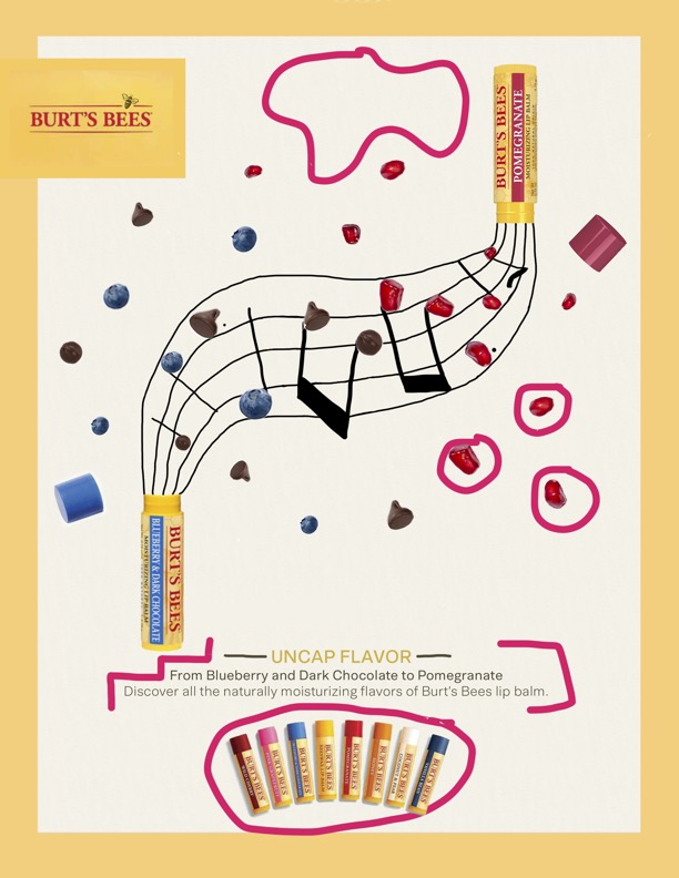
Design: With my design, I used that same element of contrast that the original ad campaign used, using a white background and bright, bold colors on top of it to make them pop. I used the same repetition of all of the chapstick tubes at the bottom each time. I also used the same fine line doodle style that the other ads used. I center aligned the text in the same way the others did and grouped the text and main graphics.
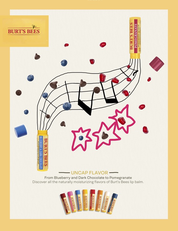
Color: I used bright and bold colors just like the original ad. I leaned into the playful and fun colors. I used matching colors with the chapstick flavors to help stay with the theme.
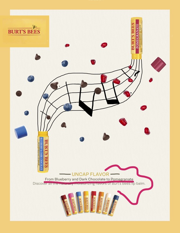
Typography: I used the closest fonts that I could find to the original ad and used the same alignment and colors to match it as perfectly as I could.
Conclusion
My ad matches the original ad campaign because it uses the same style, colors and fonts. I did my best to match the vibes and come up with a similar look. The main thing that I focused on was the visual graphic. I started by picking two chapstick flavors that hadn’t but used in the other ads and brainstorming different themed doodles to use. I decided on the music notes and then worked on coming up with a fun design that made the two different chapsticks interact together in the same way that the original ads do. Once I completed that main graphic, then I found fonts that matched the original ads and used a similar script to the ones in the original ads.

